Simplifying Pricing to Build Trust:
Danske Bank Marketplace
When Danske Bank set out to launch a product marketplace for its customers, there was one big problem:
People didn't trust what they didn't understand.
Pricing felt hidden. Navigation was clunky. The result? Confusion, hesitation, and drop-offs.
So we stepped in to answer a simple but critical question:
"How can we make pricing transparent, intuitive, and trustworthy?"
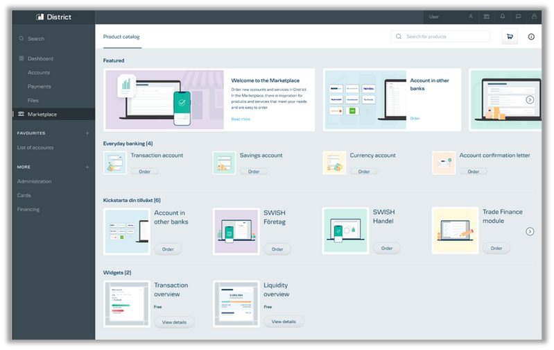
Dashboard & Price Summary
What We Did
We ran in-depth user interviews and mapped out the entire user journey through the marketplace. We didn't just ask "what's wrong?" — we watched, listened, and looked for hesitation, uncertainty, and frustration.
Here's what we found:
said the marketplace was confusing due to unclear pricing and too much back-and-forth
lacked confidence in what they were seeing — worried about surprise fees
said they needed a clear breakdown of extra charges to make informed decisions
even wanted a simple price summary emailed to them for later reference
felt they had to contact the bank just to understand the pricing
Outcome

Marketplace Dashboard
Redesigned interface with clear pricing structure

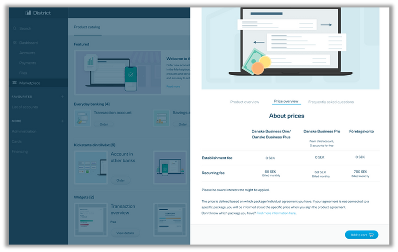
Price Summary Screen
Transparent breakdown of all costs
Journey Chart
Clean layout, appealing to customers
Customers don't notice the price comparison upfront
Users can access product price info quickly
Lacks detailed breakdown of monthly pricing
Overview of the product, monthly pricing is displayed
Lack of info about breakdown of prices
Customers can checkout quicly after choosing products
Additional fees show up unexpectedly
Clear summary of selected products shown
No monthly breakdown displayed
Easy to compare monthly/yearly pricing
Users felt forced to go back multiple times for missing details
What We Solved
From this research, we uncovered actionable insights:
Make pricing intuitive
Simplify navigation and show both monthly and yearly costs side by side.
Remove uncertainty
Break down extra charges — no more hidden fees.
Give users what they want, before they ask
Let them download pricing summaries and view their orders clearly in a dashboard.
Outcome
These changes didn't just improve UX — they built trust.
90% drop in pricing-related navigation issues
85% boost in customer clarity around pricing breakdowns
80% positive feedback on the new dashboard experience
Takeaway
Clear, transparent pricing is a trust-building, conversion-driving strategy.
That's how you get users to say "yes" with confidence.